IFEED REBRAND & WEB RESKIN
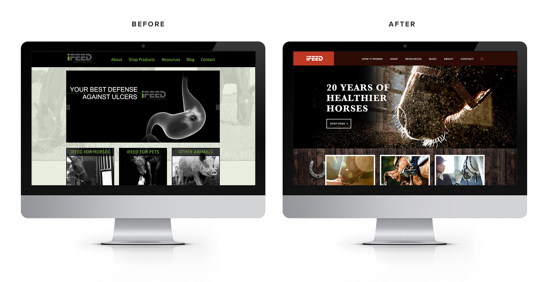
iFEED is a company that makes automated horse feeders meant to emulate natural grazing. These feeders have proven to drastically improve horse health and prevention of ulcers and colic. Before I began working with iFEED they looked like an animal cruelty website. Or a website for a robot called an "iFEED" that eats horses. Needless to say, they had a great product but needed a face lift to match. After a brand refresh and a fast re-skin of their website, they got just that....
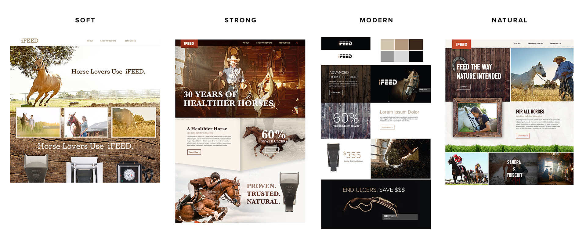
REBRAND PROCESS; Four Directions
After an intensive discovery meeting I presented several visual/messaging directions for iFEED to respond to. These were in the form of a homepage design. The 4 directions were: SOFT, STRONG, MODERN, & NATURAL. After seeing these visual directions and how the messaging could work with each, we ended up landing somewhere in-between Strong and Natural.
REBRAND PROCESS; Final Moodboard
I then provided a final moodboard that leveraged the aspects of those two directions that the client liked. When they signed off on it we started the next phase; New Photography.
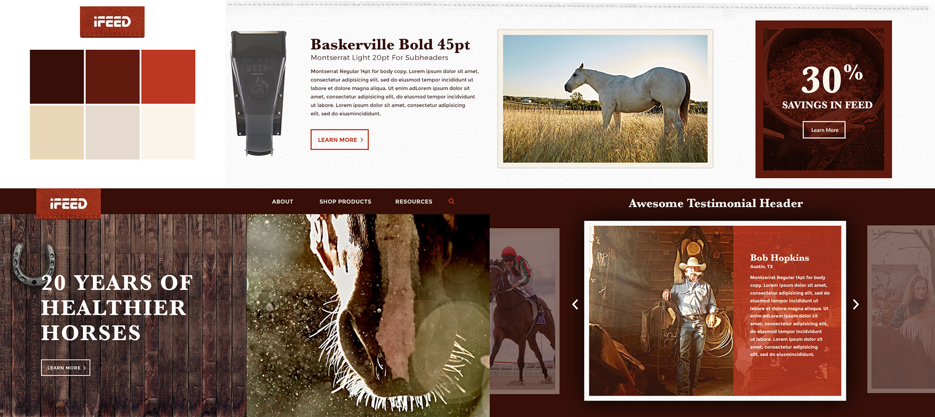
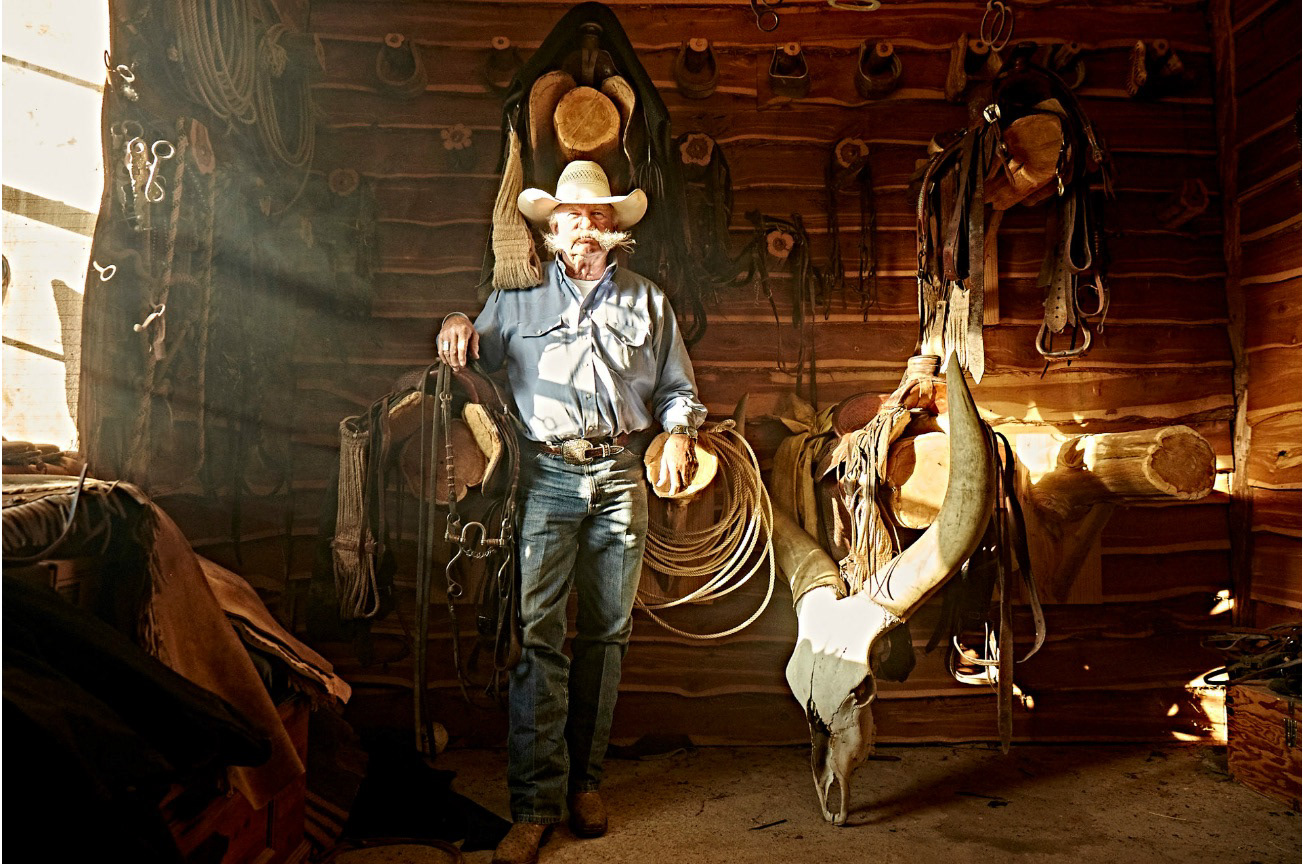
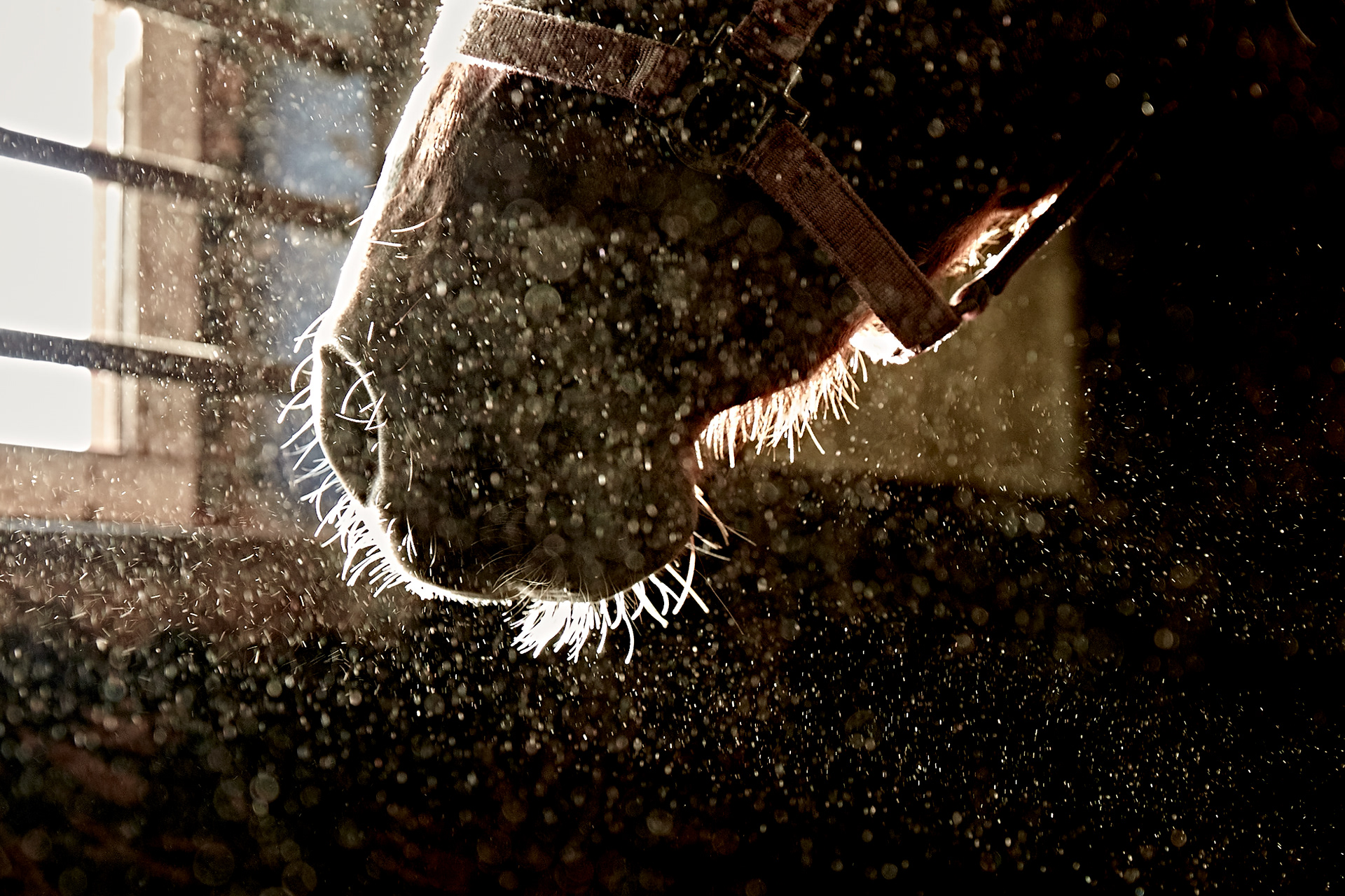
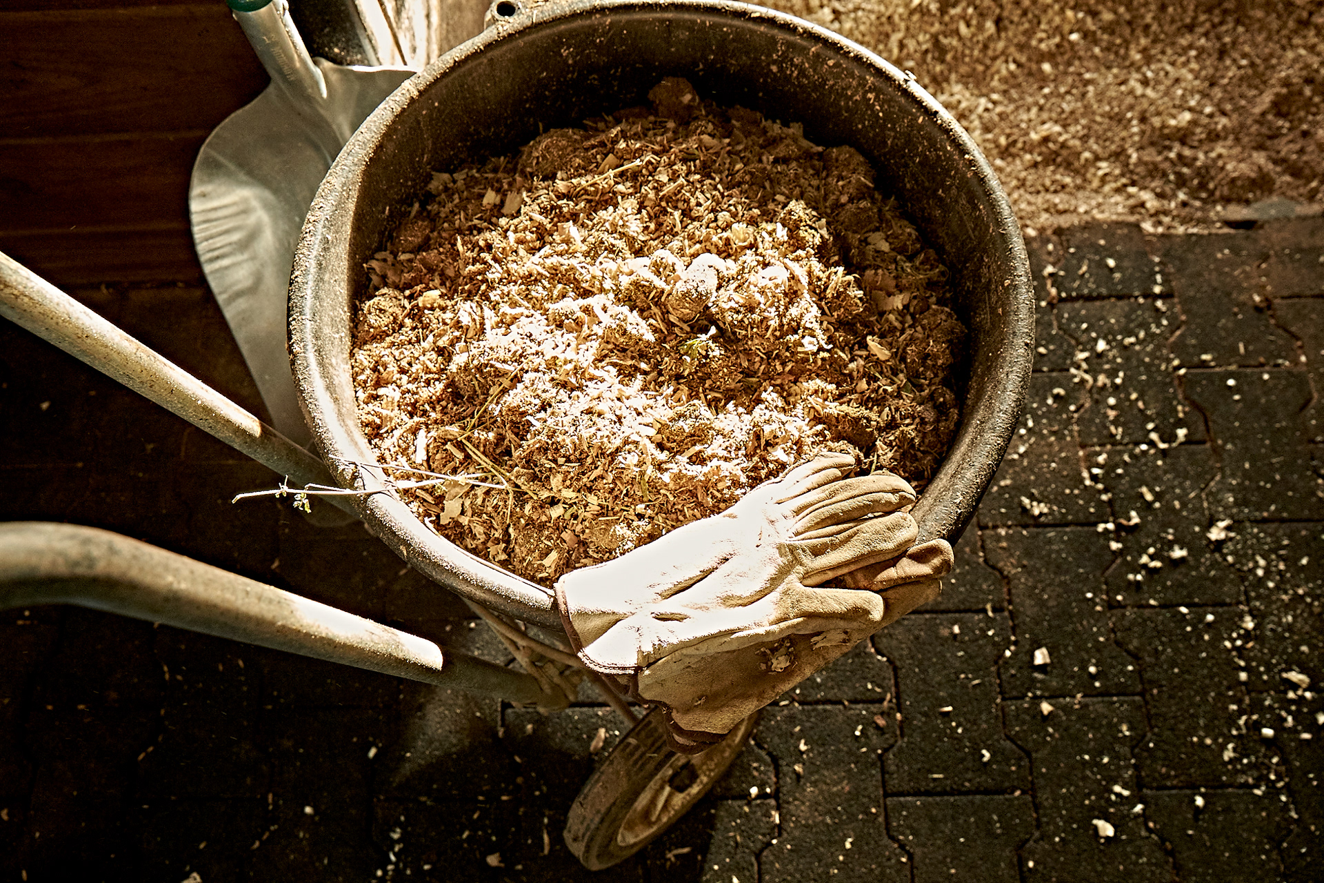
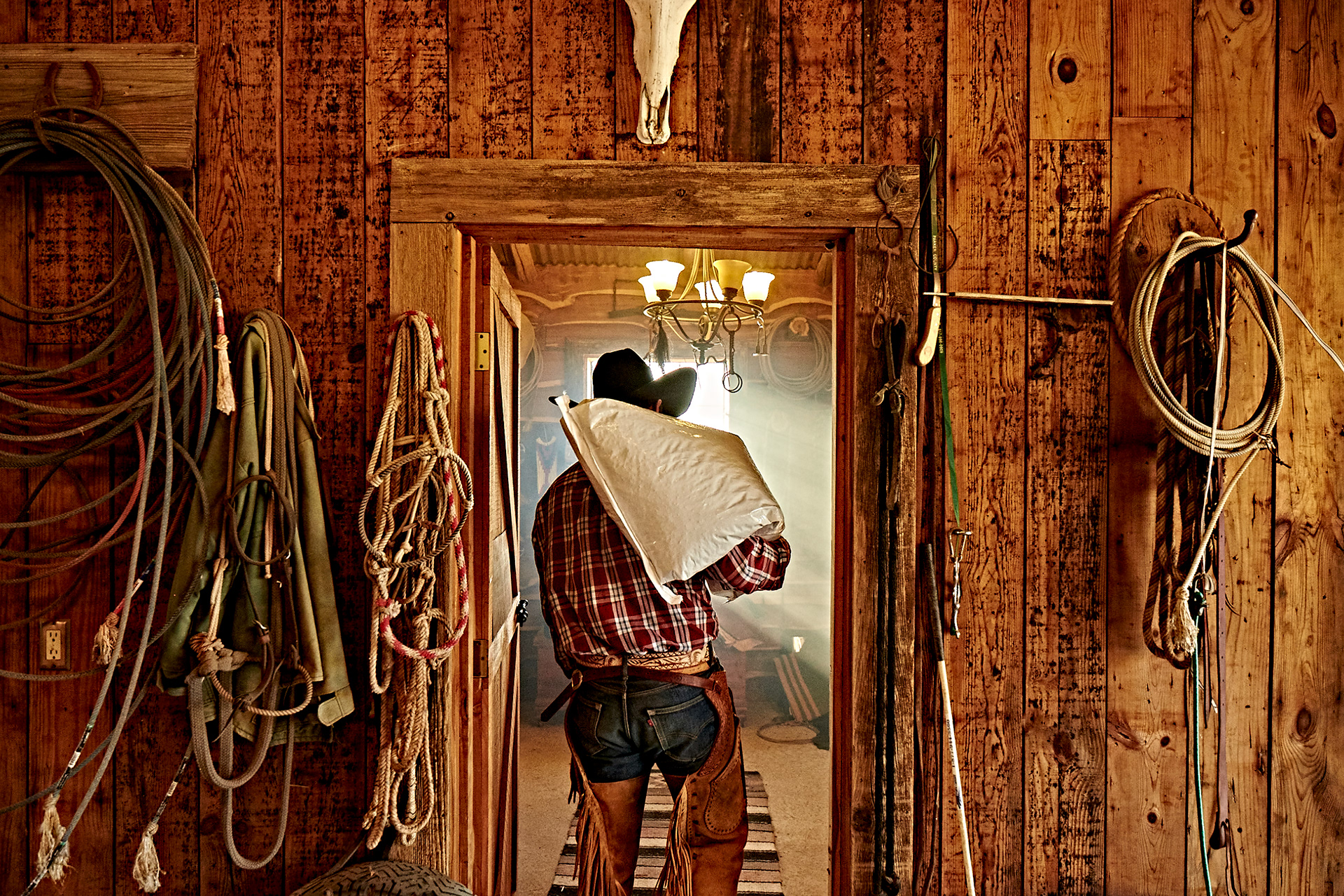
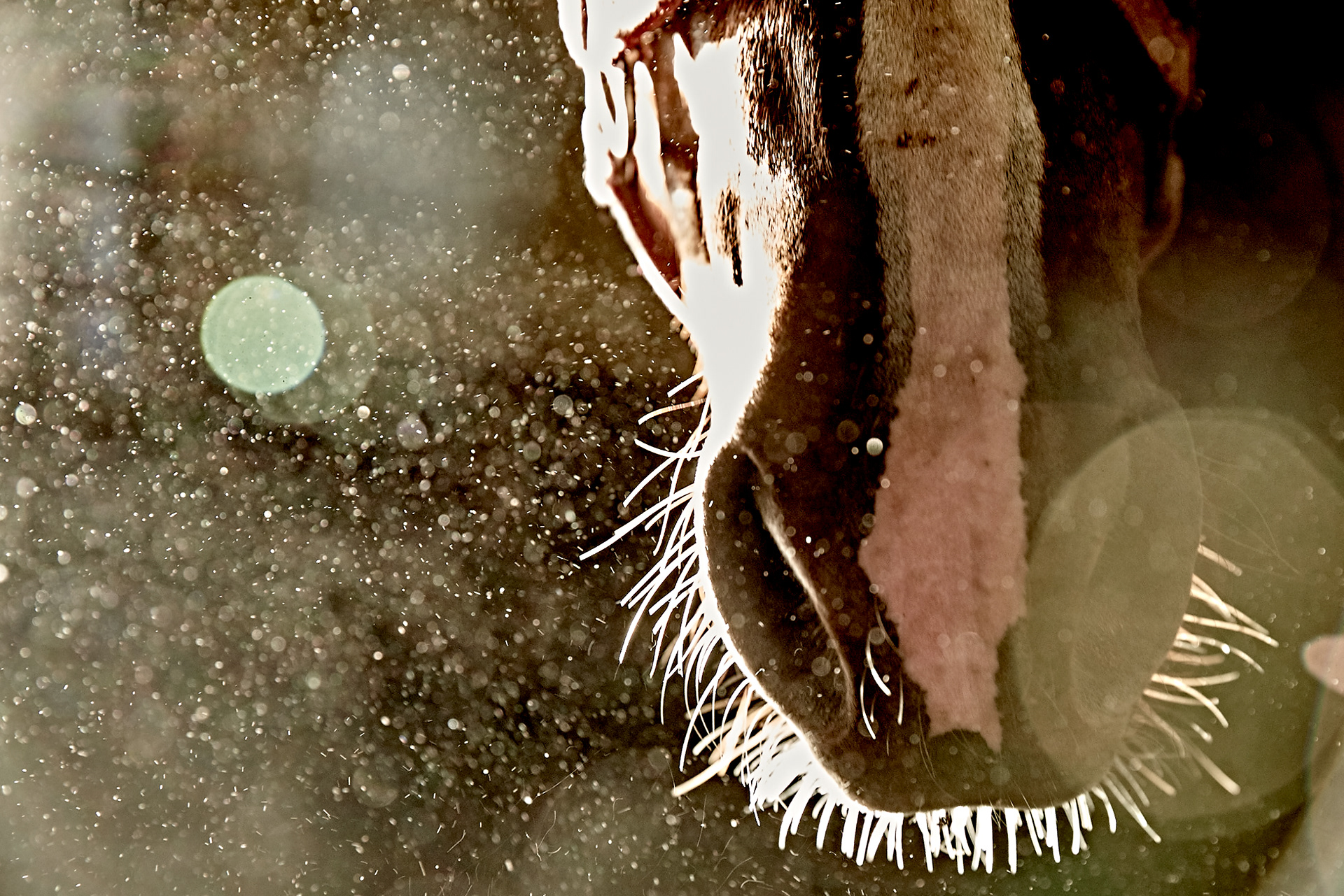
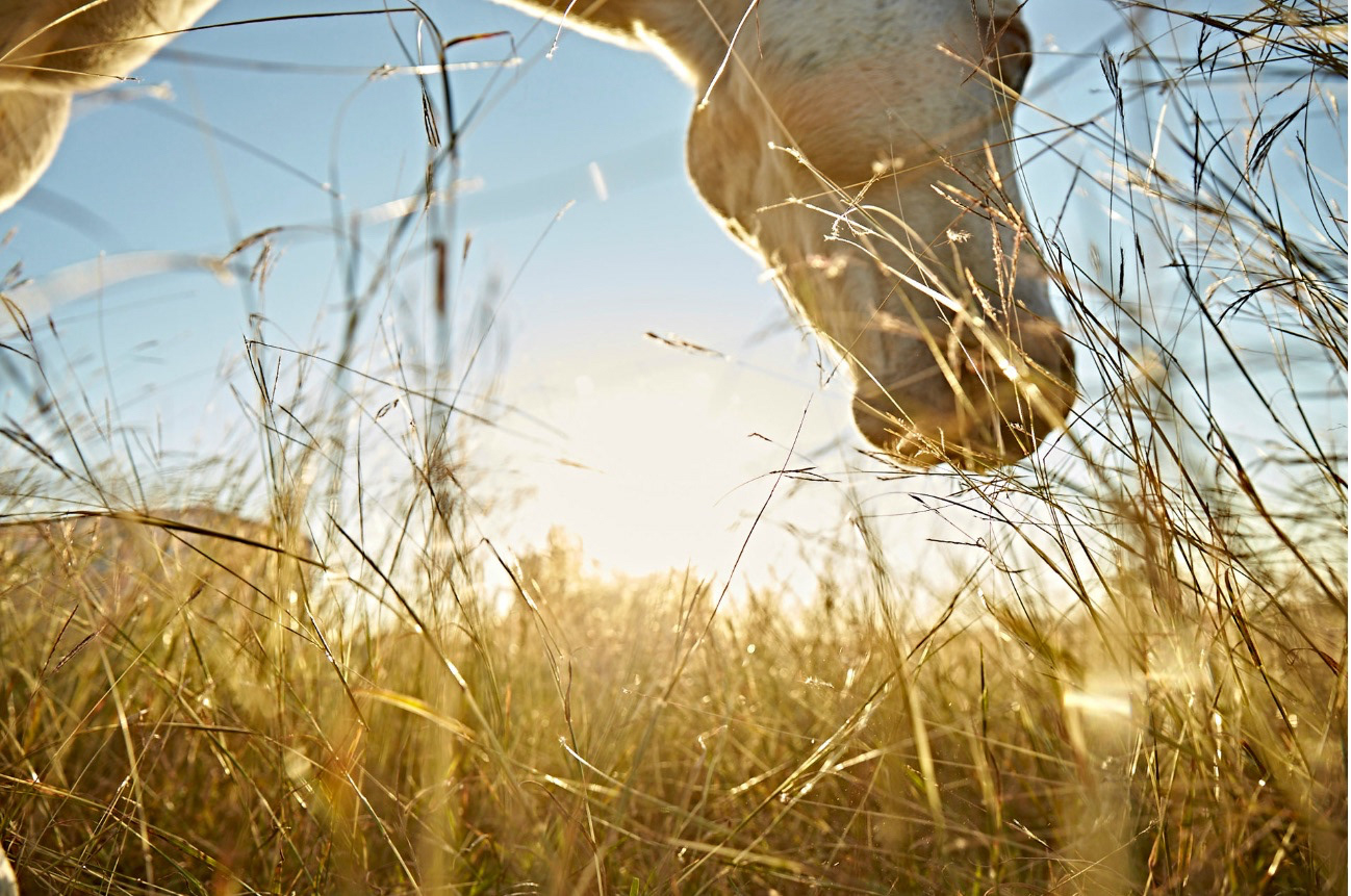
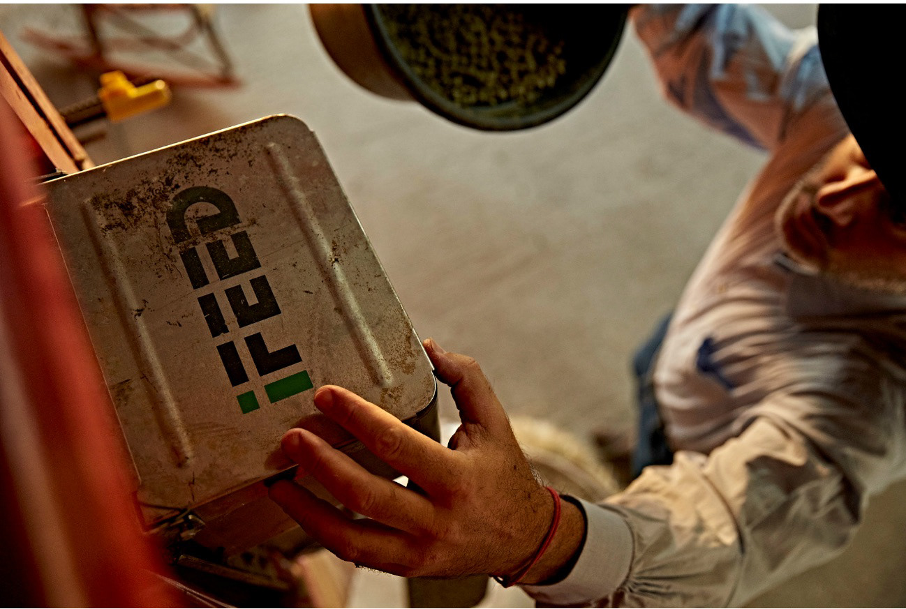
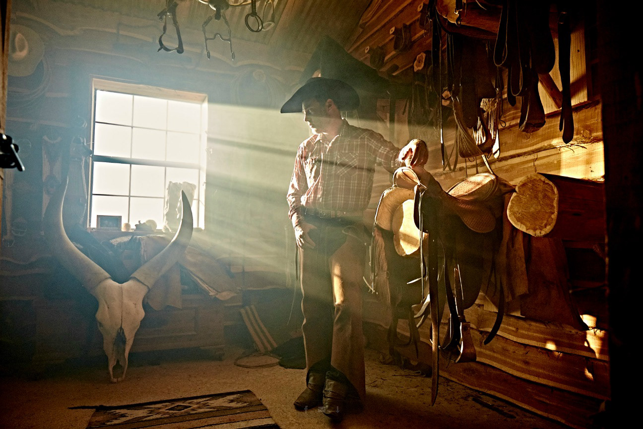
PHOTOSHOOT: DUST, RUST, LEATHER, GRIT, FUR, BARN WOOD
After establishing the direction that we wanted to head, we needed some beautiful photography to make it all happen. The client had a fantastic photographer, Jeff Tucker, that they wanted to use. I provided some art direction to him. We asked for photos that had a certain "grit" to them. We wanted dust, wood, warm tones of sunlight, close shots of horses, and old barn wood. We wanted focus on the horse’s mouths, mains, and muscles that display the health of the horse. The photographer, Jeff Tucker, absolutely nailed it, providing a stunning set of photos for use to use throughout the website.
PHOTO CREDIT: JEFF TUCKER